I had the opportunity to create architecture and wires (and later visual designs and adapted design system) for a new television app for Redbox On Demand. It was an incredible experience and I’ve learned a great deal about tv experiences, customer habits, and visual design.

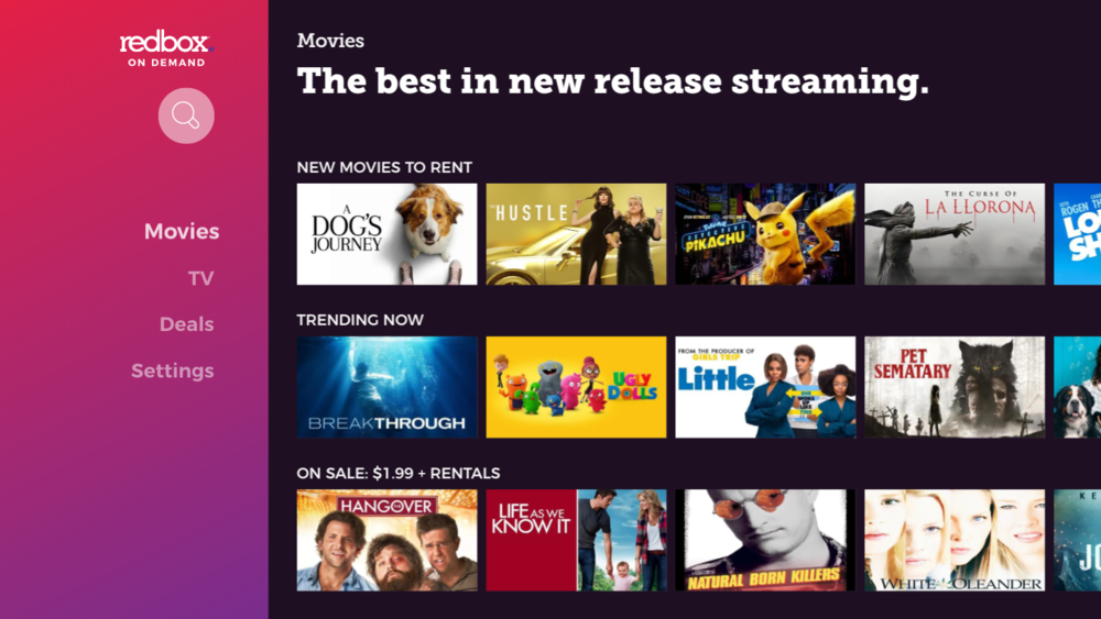
2017 home screen of the Redbox app on Roku (Before). This was a white-labeled app that had poor performance and relatively low usability scores.
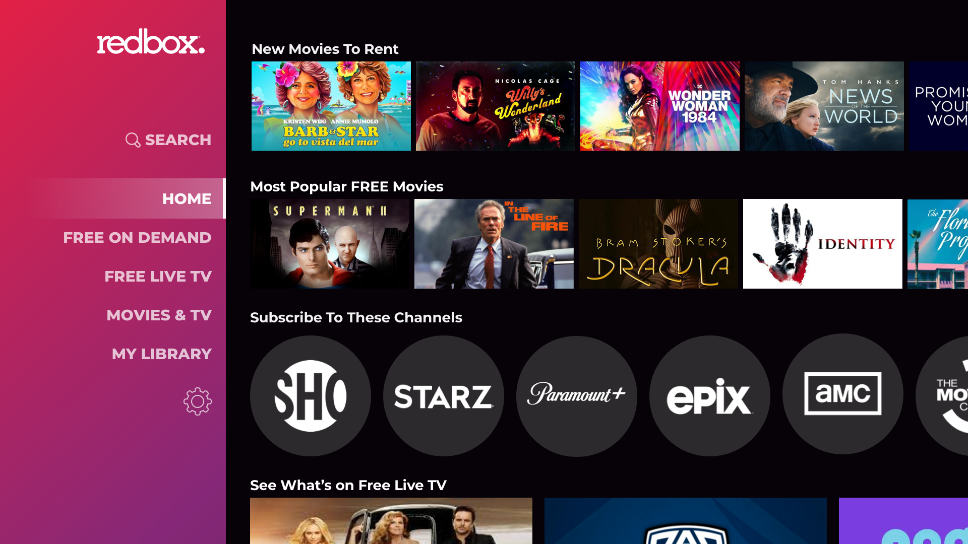
Home screen of the Redbox app on Vizio Smart TV’s (2018, and 2021 planned, respectively). 2021 visual design created by me, using an existing design system.
Background
Before I started working on the Redbox product for CE Devices, the product was a white label of a 3rd-party product. It had an outdated, complicate interface, that did not look like the rest of the Redbox experience. Customer Satisfaction was relatively low for how simple the app was, at 72% for “Satisfied” or “Highly Satisfied”. Product wanted to hire a third party to build an improved, custom product. My visual design partner and I convinced stakeholders that we could deliver a better experience for cheaper, within the expected timeline. We succeeded in creating an app design that is easy to use, on-brand, and immediately increased Customer Satisfaction to 86%.
Learning About the 10 Foot Experience
As this was a new design interface for me, I had to learn about best practices for the “10-foot experience” - designs that you interact with from your television. There are many different types of TV apps - for Smart TVs, streaming devices, gaming consoles, etc - with slightly different requirements for each one.
Some specifics about a 10-foot experience:
People don't read on a TV
TV's aren't intended for paragraphs. Limit text to only what's needed, and show rather than tell.Operate with a remote
While your mobile app has 20 titles that are 1-tap away, that can translate to 20 separate button presses on the TV remote. This also means frustration when entering a lot of text, like user name and password. When possible, allow the use of speech to text for inputs.Very low processing power (and very high)
Most Smart TVs are only kind of smart. The processing power can be much lower than a regular computer, or even smartphone. Heavy use of graphics and animations will frustrate users with slow performance.
Gaming devices, on the other hand, have particularly high processing power. A lack of transitions or animations can cause the app to clunky and cheap.Ready to watch
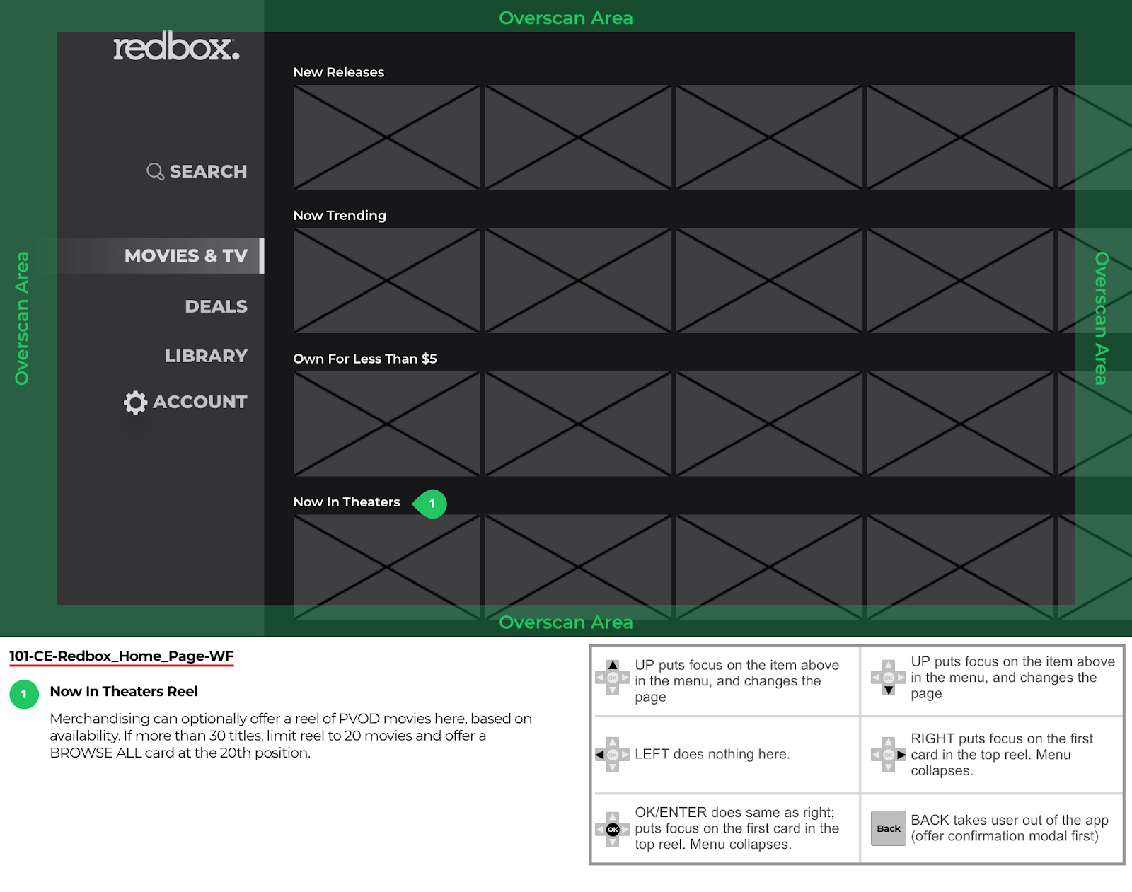
People use their TV because they’re ready to watch. Beware of adding extra features, complicated navigation, or contributing to too much browsing.Overscan
Not all TVs are exactly the same size and shape. to account for overscan, stay away from the outer 5% of the screen.

Complete workflow of planned app for CE Devices. Wireframe was created by me in Sketch.
Goals & Workflow
Since Redbox isn’t a regularly recognized streaming provider, it was important to allow customers to browse without signing in.
I wanted to create a shallow navigation structure to limit complexity on a TV.
Wireframes & Prototyping
After reviewing the goals, features, and workflow with stakeholders, I created wireframes and built a prototype with Marvel.
Since then, I’ve moved to testing in Protopie so I can mimic remote control behaviors rather than require mouse clicks, which can lead to drastically different feedback.
Wireframe created in Sketch by me. Prototypes built in Marvel did not include Notations or any items in green.
early user TESTING
Competitors, like Amazon Prime, assume their customers want high-quality video resolution rather than the lowest price. Redbox customers are much more price sensitive - they expect the lowest price from Redbox, no matter what.
I tested a couple of Marvel Prototypes with UserZoom to settle some questions about the ideal workflow, based on the above OKR’s. Workflow and wires were updated based on those results.

Since our customers are price sensitive, we focused on a user experience that supports them getting the lowest price we can offer. The design above was completed by me.
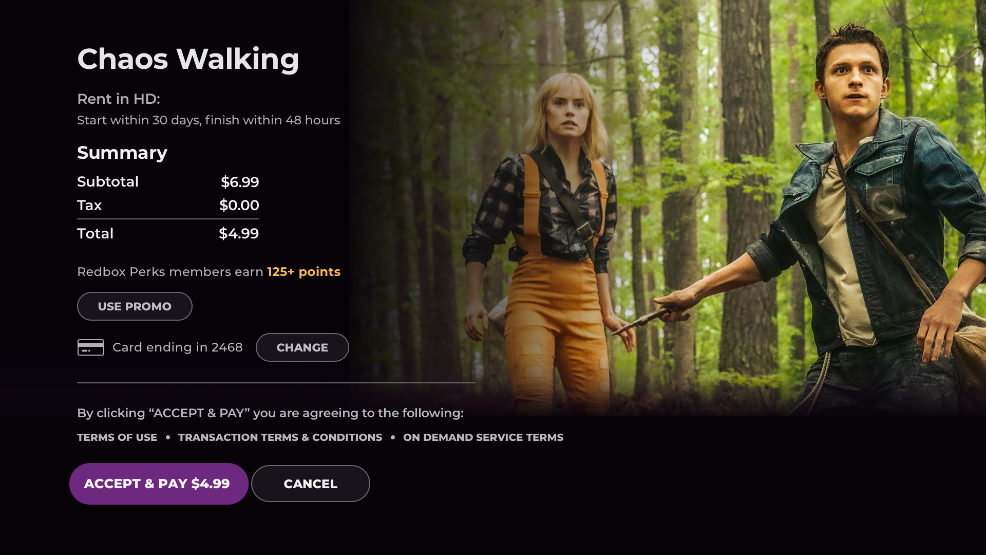
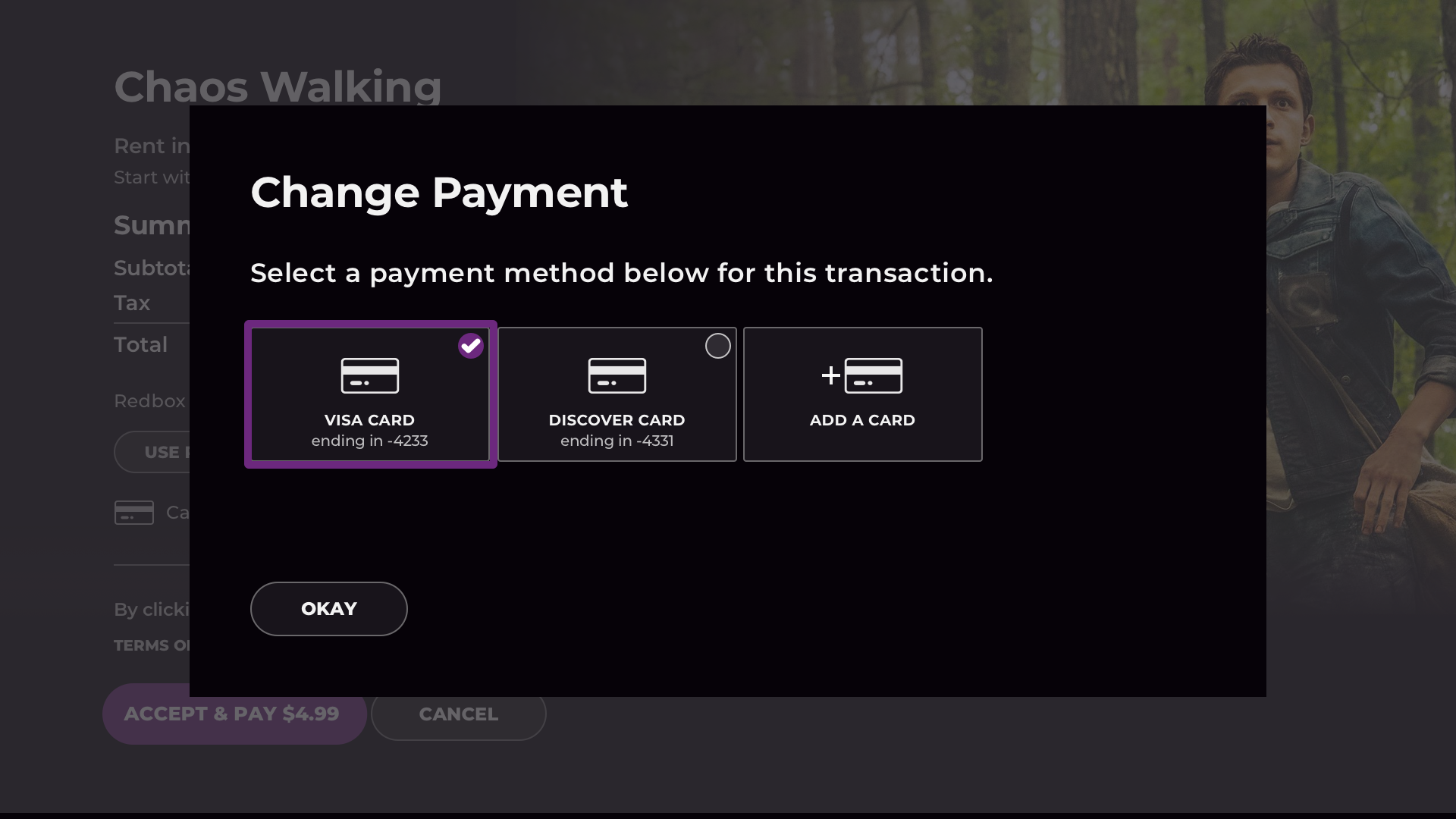
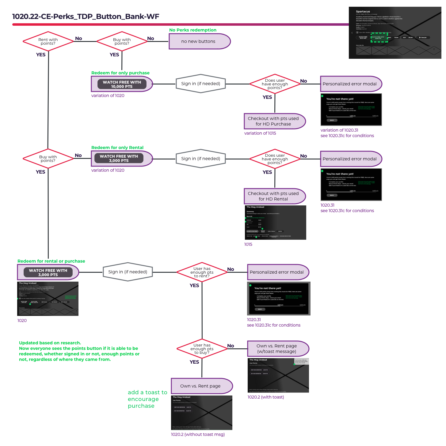
ADDING DETAILED LOGIC
After the wires were approved, the visual designer created beautiful and compelling visual designs. Based on these designs, I followed up with supporting detailed notes as explanation.

Descriptive notes for specifying the logic of title art in a library. Created by me using Sketch.
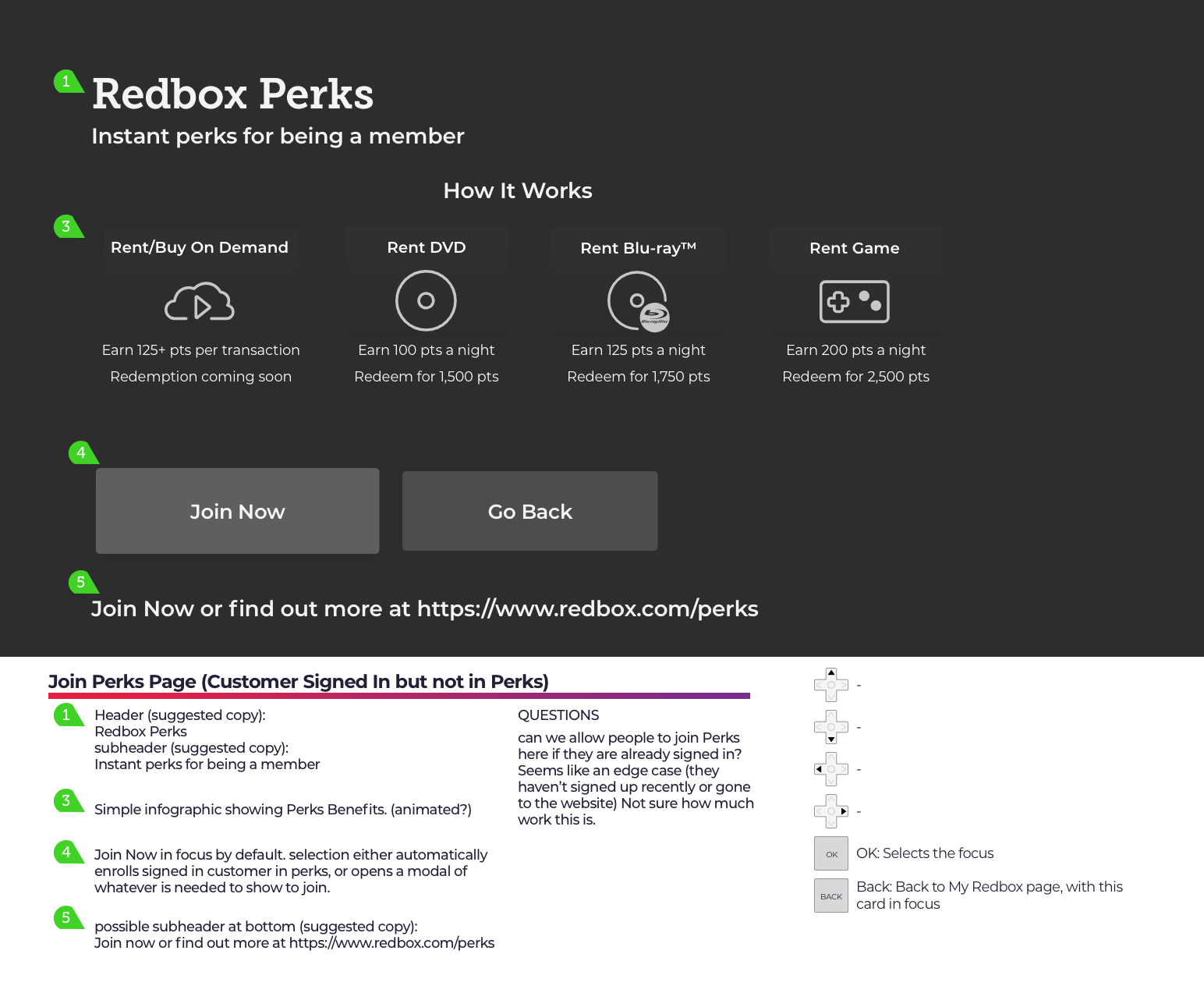
New Features
Supporting a product means continuous response to customer feedback and the addition of new features in an agile environment. Usabiity testing using remotely-controlled prototypes helps me validate new designs before they’re available to customers.
Visual Design Updates
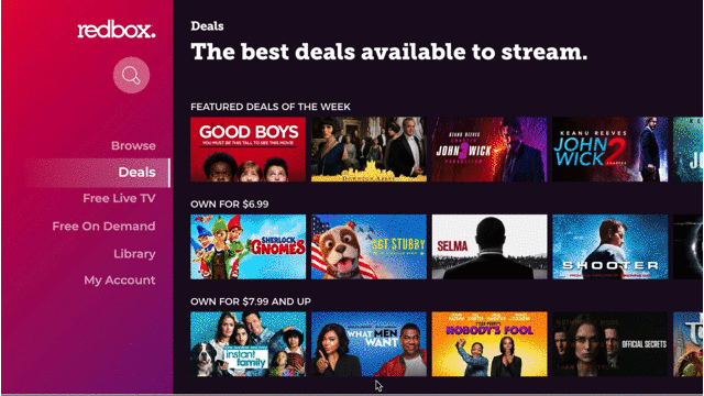
I also create additional visual designs as needed based on the availability of a visual designer. One example is the Roku platform button styles, which have limitations on size and behavior.

Image was created in Sketch by me, based on requirements from Roku and existing cross-platform button labels.