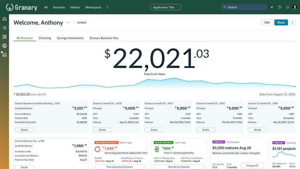
An online banking dashboard for small business owners, designed for a client bank. Existing research was with finance teams at mid-size organizations and consumer account holders - not the owner-operators this product was for. So I ran my own informal research, and it changed what the dashboard leads with.
A note on this project
"Reproduced from memory, for the US market. No client name, data, or artifacts are used."
The original was built for the UAE. Here, fixed-term deposits appear as US certificates of deposit and everything is in dollars. I did not attempt to reproduce Arabic translations or represent Sharia-compliant products that were found in the real designs.
Overview
Online banking for a country-wide SME initiative
In 2024 the UAE issued directives to support and encourage the growth of small-to-medium enterprises. The bank's focus inside that initiative was the smallest end of the market: micro-SMEs, businesses with up to three employees turning over less than AED 3M (roughly $1M USD).
These customers still banked in person. The goal was to move them online without losing them: improve the online experience, capture a growing market of existing personal banking customers, and grow with owners as their businesses got bigger.
Constraints
Nine time zones and two writing directions
- 01 Language. English and Arabic were both delivered, left-to-right and right-to-left. Numbers, currency, and IBANs stay left-to-right in both. Font sizes and weights don't match across the two, so a layout that balances in one can break in the other.
- 02 Time. Nine to ten hours between the client and me, which left a narrow daily window for conversations. Very early mornings were the norm for me.
- 03 Culture. Naming conventions caught us early — drafts that greeted the user as "Good Morning, Abdul" were wrong in a way no style guide had flagged. Sharia-compliant offerings also constrain what can be sold, including interest rates and certain investments.
- 04 Process. Every design was reviewed by senior executives and below, with limited appetite for research along the way.
Discovery
The research that existed was about someone else
What I inherited was a limited set of interviews with dedicated finance teams at medium-to-large organizations. It was useful, but it described a different job: impersonal, largely paper forms that had been moved onto a screen, problems with the money transfer workflow, and a heavy reliance on tasks that still had to happen in a branch.
Personal banking usability studies added two more findings worth carrying forward: a general disinterest in fixed-term deposits, and real difficulty getting a combined view across accounts.
None of it covered the actual user — a business owner who is also the bookkeeper, with nobody to delegate to.
Guerrilla research
Eight conversations, three countries, no budget
So I ran my own, with the help of the User Research Center of Excellence I founded and ran at the consultancy. Eight informal conversations with small business owners across the US, the UAE, and Hong Kong, all business owners with 2 employees or less. The questions they had about their own money were remarkably consistent.
What owners actually asked
"How much can I pay myself this month without creating a problem in six weeks?"
Alongside the two that came up every time: What do I have available now? and Who has paid me?
- 01 "I don't care about what I've paid. What's coming up?" Every existing view was a record of the past. Owners were trying to see forward.
- 02 "I'll need to purchase in the next three months. Do I need to take out a loan, or will I have money available?" Business owners must constantly check what money is moving where, and make judgement calls on when and how to keep investing in their business.
- 03 For business owners we talked to outside of the US, multi-currency is the default, not an edge case. Treating a second currency as an exception is a mistake.




The design
Focus on what's available and what's coming up
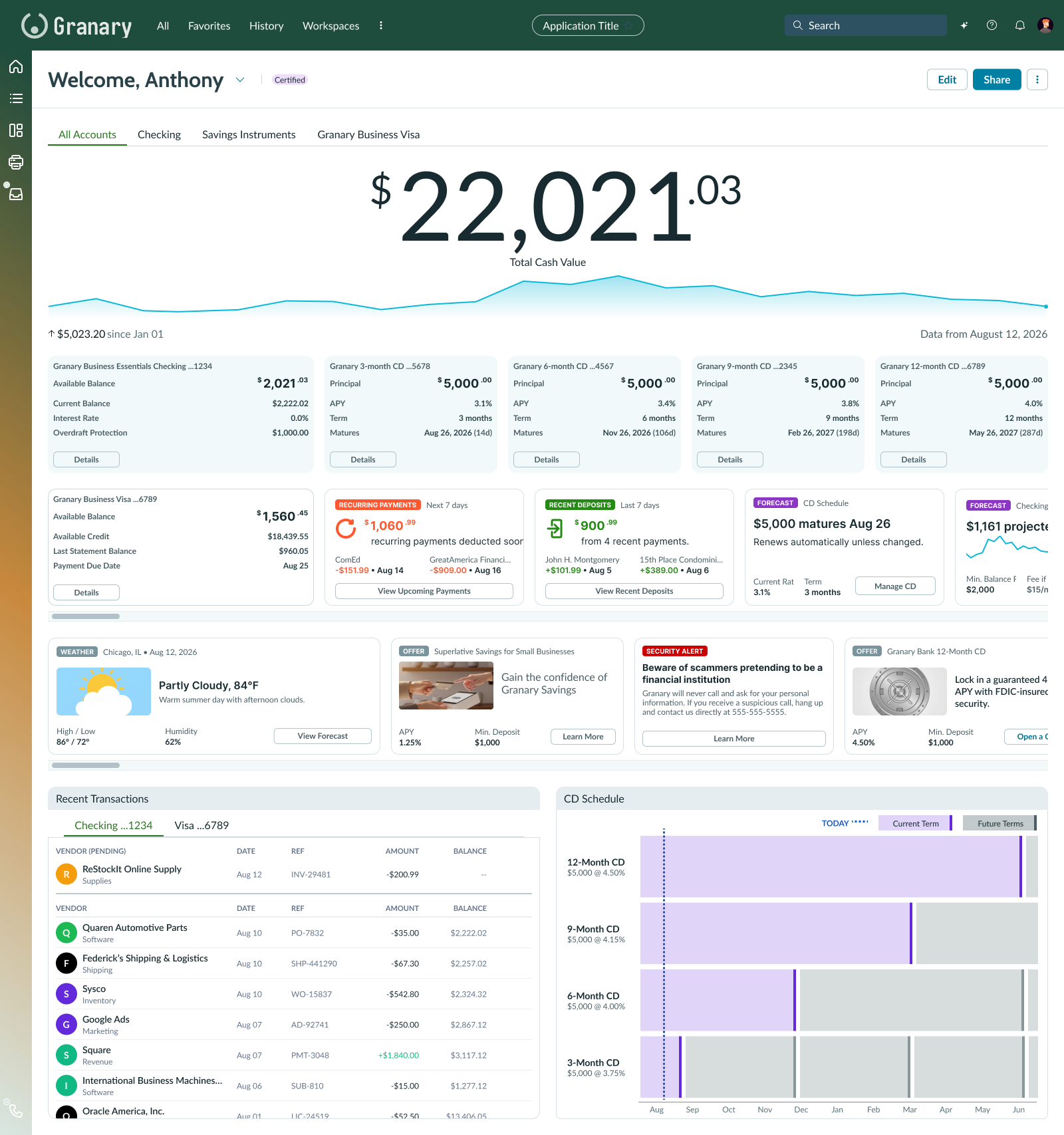
Responsive
The same answers, 440 pixels wide
Owners in these conversations checked their accounts between other things — in a van, behind a counter, waiting on someone. The phone layout keeps the desktop's order of answers rather than reshuffling it to fit: total cash value first, then the accounts, then what's coming up.
Progressive disclosure does the work the wide rows do on desktop. Checking and the nearest CD show by default, with the rest behind Show more deposit accounts; the forward-looking widgets collapse the same way. The CD Schedule stays at the bottom rather than being dropped for space — on a small screen it is the reason to keep scrolling, not the first thing to cut.

Scroll the screen to see the full layout.
Visualization
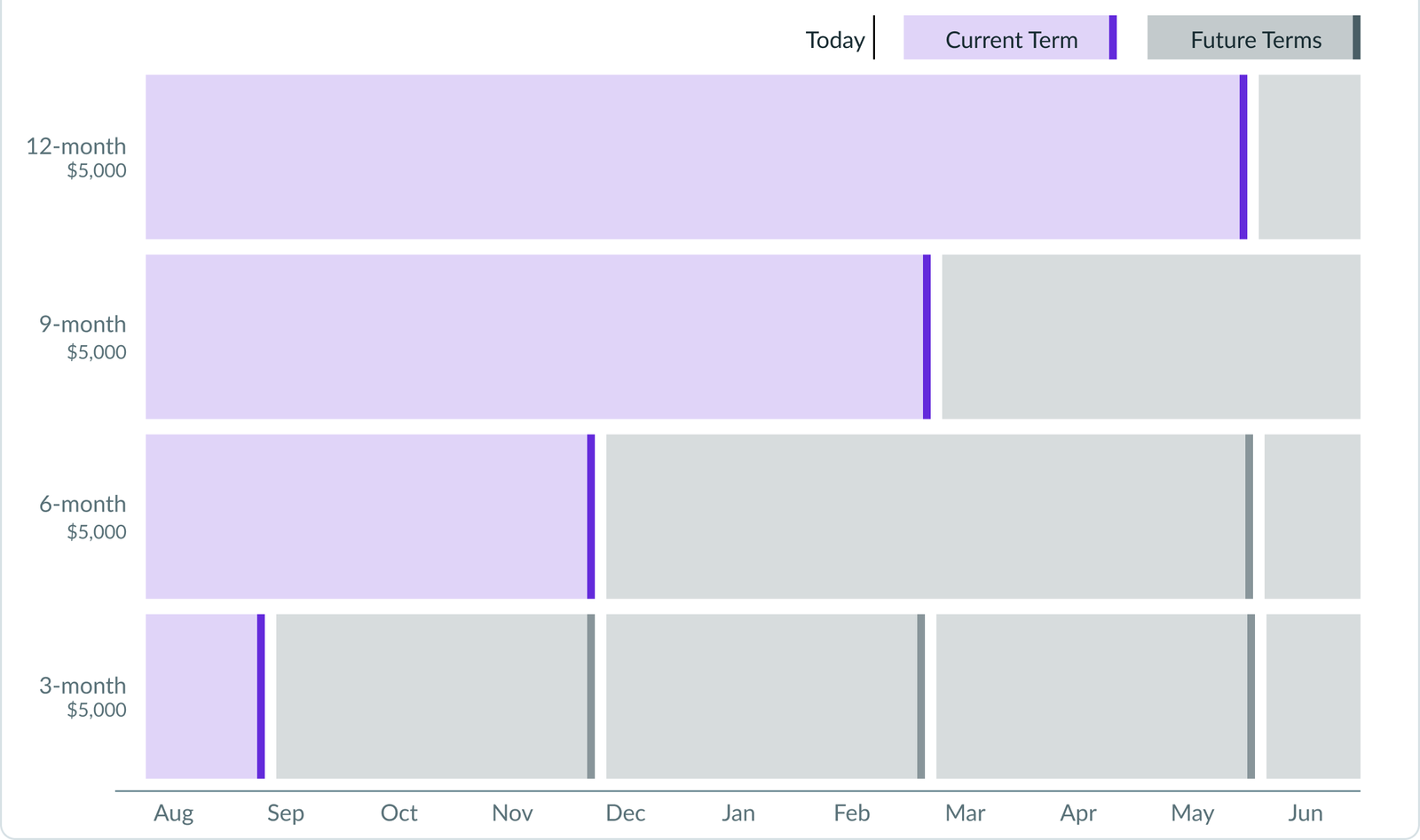
The CD Schedule highlights a user pain point
Business owners often worry about how to keep money available for planned and unplanned expenses. The CD Schedule helps owners see the benefits of CDs for saving money, and visualize when money gets freed up.
Zero state
The same chart, for owners who don't hold any CDs yet
The CD Schedule only says something if you already have certificates laddered. An owner with none sees an empty chart, and an empty chart teaches nothing. So the zero state fills it with a worked example instead of an explanation.
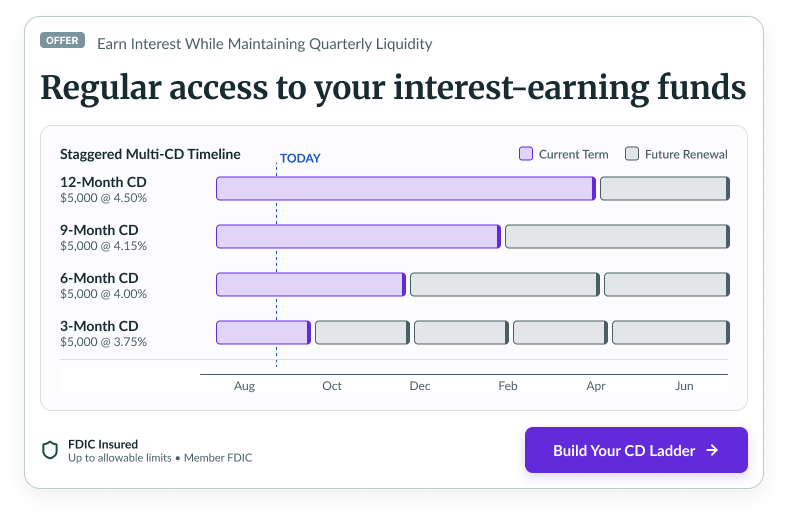
It also turns the visualization into something that sells a product, which is worth being honest about: the same chart that helps an owner plan is the chart that moves them into fixed deposits. That is exactly the tension the client ran into next.
Results & reactions
The visualization drew the most enthusiasm — and the sharpest objection
8
Owner conversations, where no research had been planned
3
Countries represented: US, UAE, and Hong Kong
1
Strategy re-alignment between executives and lower-level management
Stakeholders and executives were generally positive. The designs were considered a major improvement over the existing website, and they incorporated feedback from the existing research and current strategies. The CD Schedule was received enthusiastically at the executive level.
The sharpest response came from lower-level management, and it was a strategy disagreement: "Fixed deposits cost us money. This would encourage people to use them more." That is a real tension — the visualization was good for the customer and expensive for the business. Surfacing it led to a larger strategy re-alignment between executives and lower-level management about what the bank was willing to deliver to attract these customers.
Reflection
What eight conversations bought
The most valuable thing in this project cost eight conversations and no budget. The research I was handed described finance teams at large organizations, though the real users ran businesses without dedicated finance professionals. Even informal discussions asking users about their experiences and pain points changed what the dashboard leads with — looking forward, not backward.
It also produced the one artifact the client argued about internally. When a design surfaces a disagreement between what helps the customer and what the business earns, that's usually a sign it is touching something real.