Data visualization · Centro
Discovery sessions and analysis of existing research reports revealed two distinct analyst personas with very different needs. I designed a suite of advanced visualizations validated with users, fully ready to build when the project was deprioritized before I left.
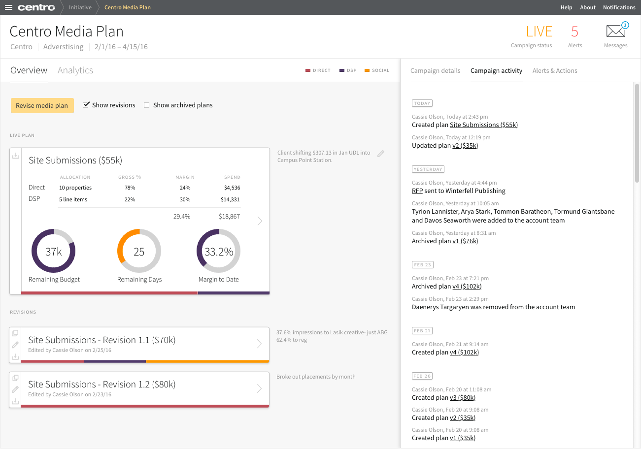
Overview
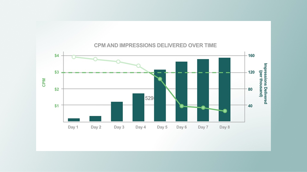
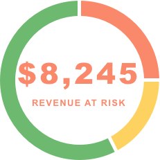
Digital marketing analysts want to see their clients' key performance indicators quickly and accurately. Basic visualizations can be frustrating, wasting precious screen space without helping analysts understand the story in the data. More advanced visualization, on the other hand, helps the analyst communicate how a campaign is progressing and make informed predictions about its success.
At Centro, I worked with analysts to identify the questions they actually needed answered about their campaigns, and designed the visualizations that would answer them.
The discovery finding that shaped everything
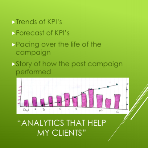
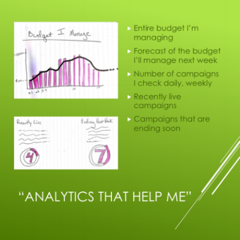
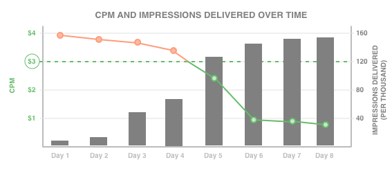
"Not all analysts are the same. Expert analysts want depth and dual axes. Generalists want speed and self-evident summaries. Designing one chart for both users serves neither well."
This split emerged from interviews and shaped the entire visualization strategy: advanced views for power users, at-a-glance summaries for everyone else.
Research & discovery
Discovery artifacts
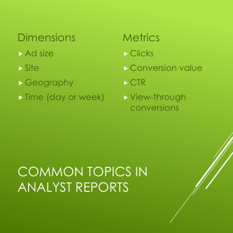
Rather than designing visualizations and asking if they were useful, I worked backwards from the questions analysts were already asking: "What does my client most need to know?" and "What do I need to know to serve them?"
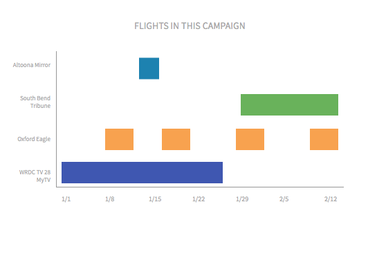
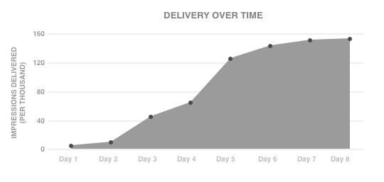
Interviews and report analysis surfaced a consistent set of themes (pacing, delivery, performance over time, and projected outcomes) that became the foundation for the visualization concepts.
User needs
Synthesis
Visualization designs
Advanced views
Evolution
Outcome
2
Distinct user personas identified and validated through research
11
Visualization concepts designed and ready for development
✓
Simpler analytics did ship in the product before departure
The advanced visualization suite was fully designed and user-validated, but was deprioritized before development began, and I left the company before it could ship. Some simpler analytics did make it into the product. The work still stands as a complete, research-led body of design work. The process was sound; the constraint was organizational.
Reflection
Not everything ships. This project is an honest example of what good UX work looks like when it's done right: rigorous discovery, clear synthesis, validated designs, even when the outcome is out of your hands. The research uncovered a real and actionable distinction between user types that would have meaningfully shaped the product had the work continued.
If I were to revisit this today, I'd use AI to dramatically accelerate the synthesis phase, analyzing report patterns and surfacing themes across a larger sample much faster than manual review allowed.