Consumer product · 2018–2021
A white-label TV app with poor usability and 72% customer satisfaction needed a complete redesign. We convinced stakeholders we could build it better, faster, and cheaper in-house, and shipped an app that hit 86% satisfaction on launch.
Overview
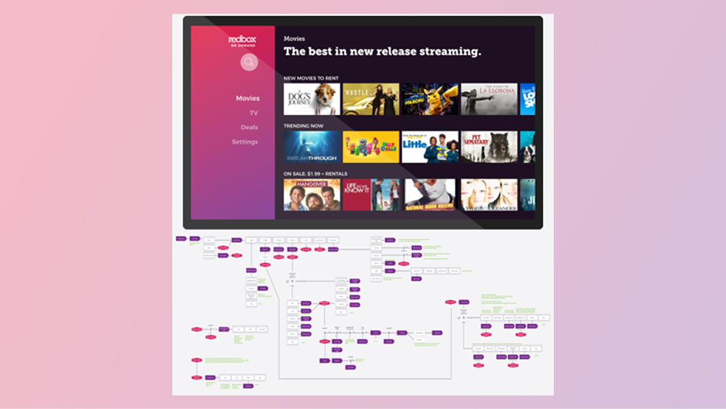
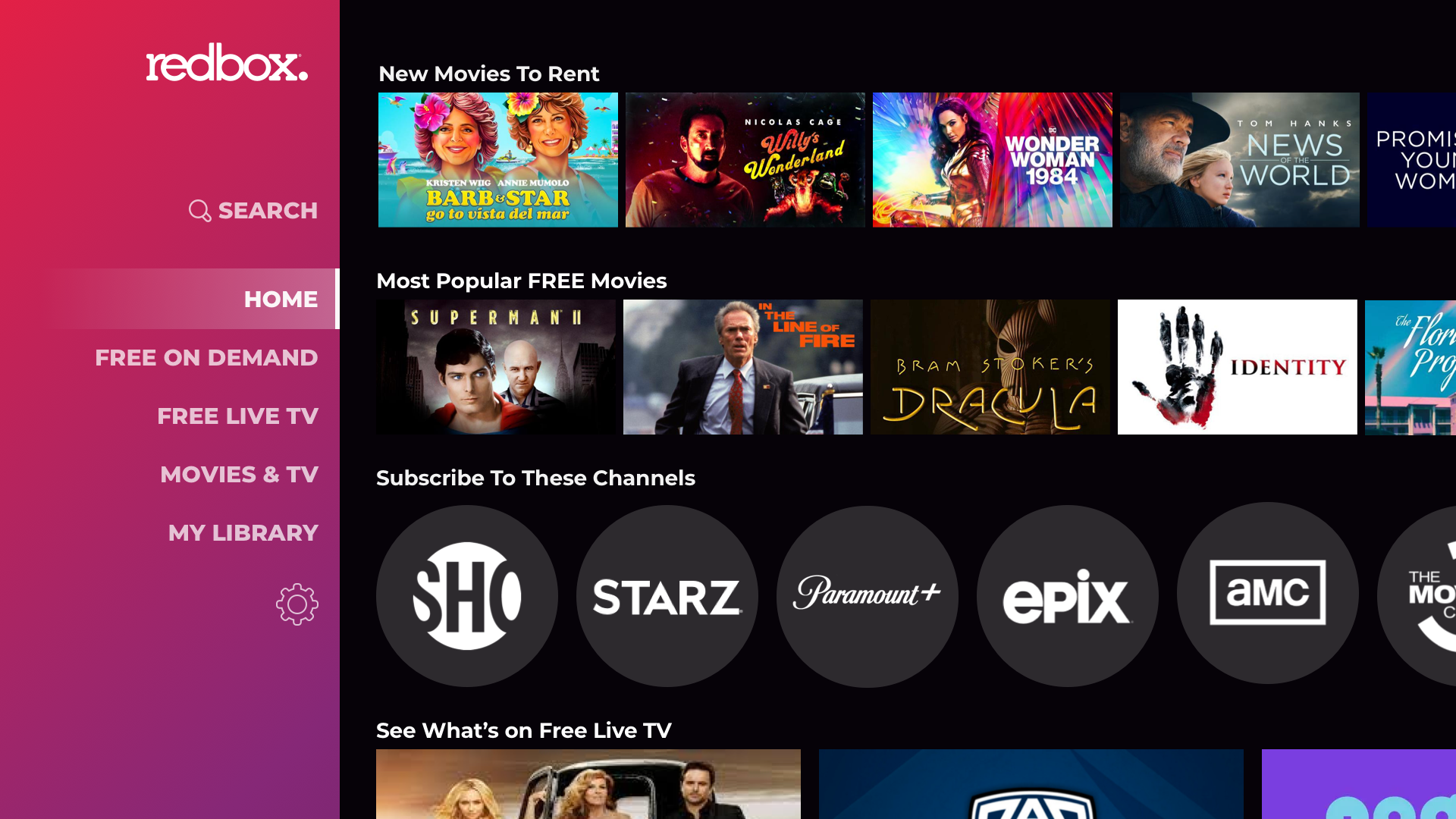
Before I joined the CE Devices team, the Redbox TV app was a white-labeled third-party product. It had an outdated, complicated interface that looked nothing like the rest of the Redbox experience. Customer satisfaction sat at 72% "Satisfied" or "Highly Satisfied" — low for an app with a relatively simple purpose.
Product wanted to hire a third party to build a replacement. My visual design partner and I made the case that we could deliver a better experience ourselves, cheaper and within the same timeline. We succeeded.
The 10-foot constraint
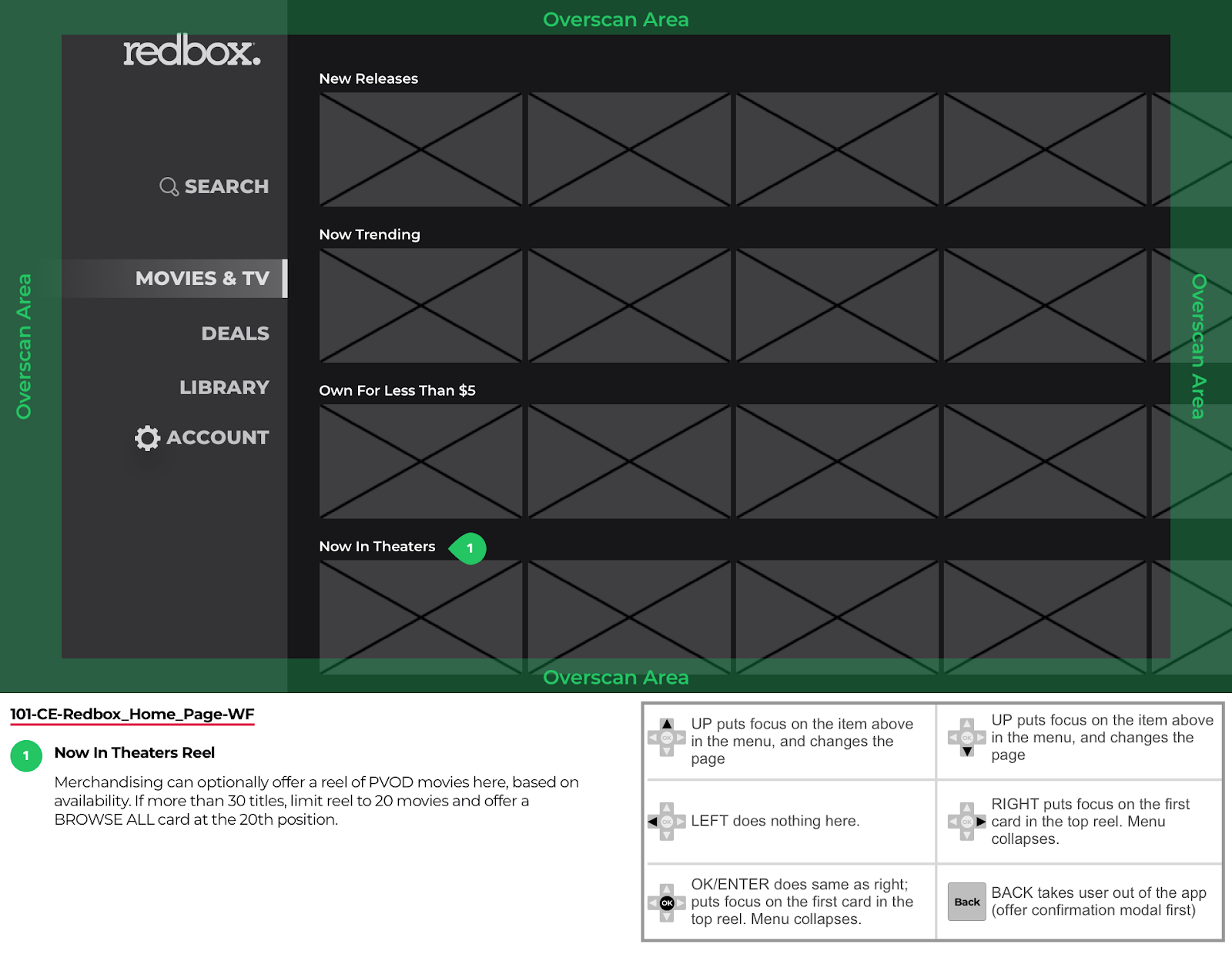
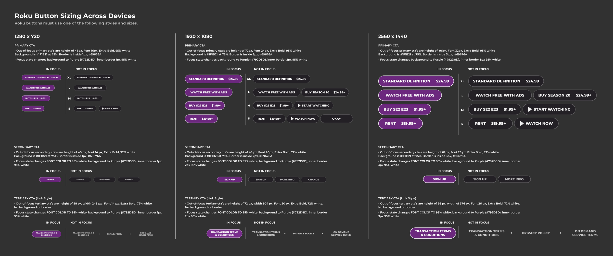
"Designing for a TV means designing for distance, a remote control, and someone who is already ready to watch, not browse."
This shaped every decision: shallow navigation, minimal text, price-forward hierarchy, and prototypes tested with remote-controlled interactions rather than mouse clicks.
Research & discovery
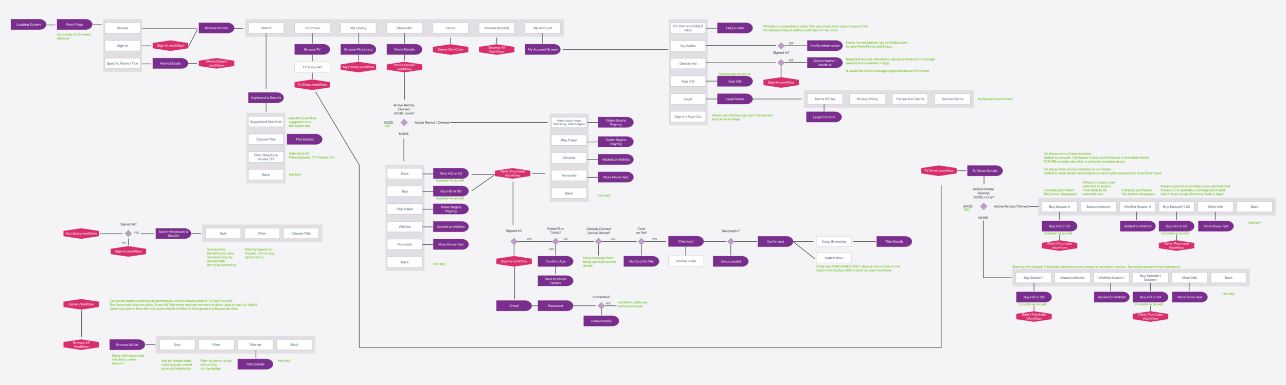
Information architecture
Since Redbox isn't a regularly recognized streaming provider, it was important to allow customers to browse without signing in. I designed a shallow navigation structure to limit complexity: fewer levels, faster path to content.
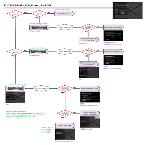
The complete app workflow was documented in a wireframe created in Sketch, reviewed and approved with stakeholders before any visual design began.
Wireframes & prototyping
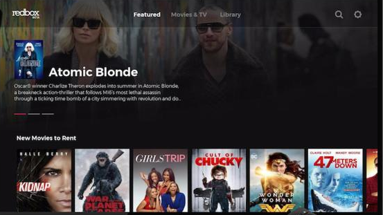
Before & after
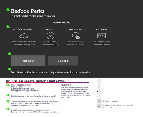
Specification
After wireframes were approved, the visual designer created the final screens. I followed up with detailed specification notes to capture interaction logic: things like how title art behaves in a library, edge cases for different content types, and platform-specific constraints.

Ongoing development
Visual design
Outcome
86%
Customer satisfaction on launch ("Satisfied" or "Highly Satisfied")
72%→
Starting satisfaction score with the white-label app
↓cost
Delivered in-house for less than the third-party quote
We convinced stakeholders we could build something better ourselves, and the satisfaction scores validated it on launch. The app shipped on-brand, on time, and within budget, and continued to evolve with new features validated through remote-controlled prototype testing.
Reflection
This project taught me that the medium is the constraint. Every design principle I'd learned on mobile and web needed to be re-examined for a 10-foot experience. The shift to Protopie for remote-controlled prototyping was one of the most valuable methodological changes I made. Mouse-click testing on a TV prototype produces fundamentally different (and misleading) feedback.