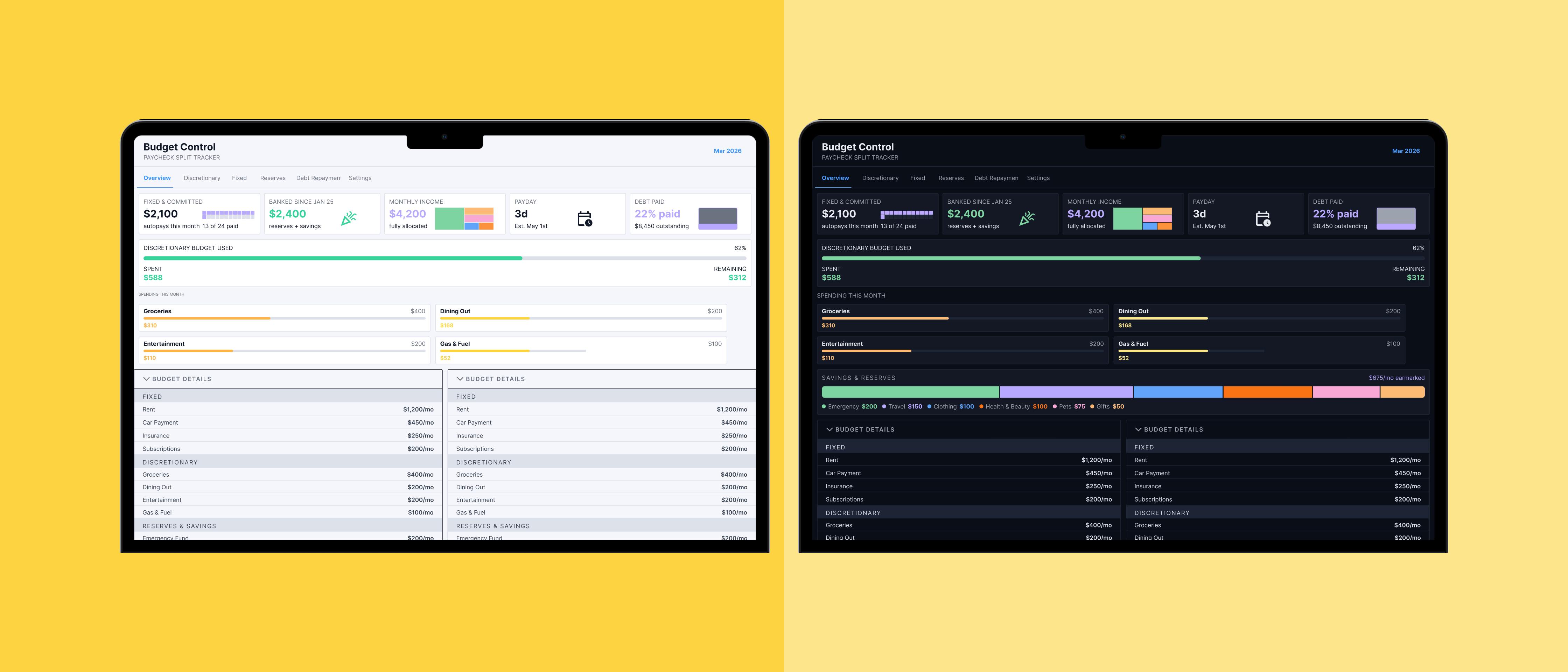
An exploration using Claude and Claude Code to design and build a responsive budgeting tool from scratch, with real learnings about what AI-assisted design looks like as a practice, not just a talking point.
A living project
"The tool is live and stands on its own — but I keep refining it. What's documented here are real learnings from the process, not a polished retrospective."
This page will evolve as the tool improves. Try it below.
Try Budget ControlOverview
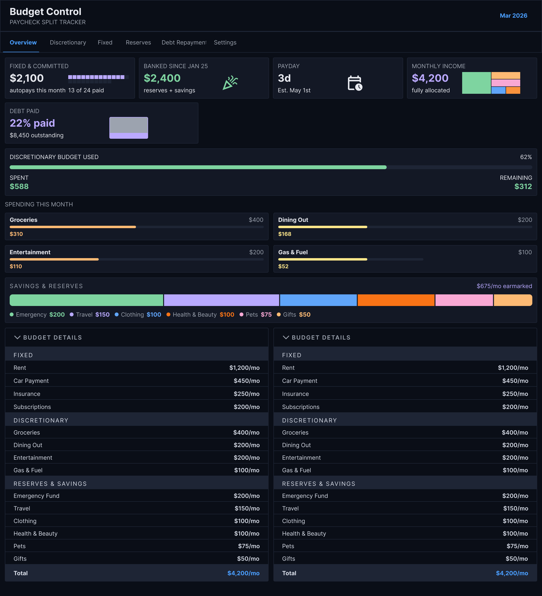
A personal finance dashboard, built without prior React experience
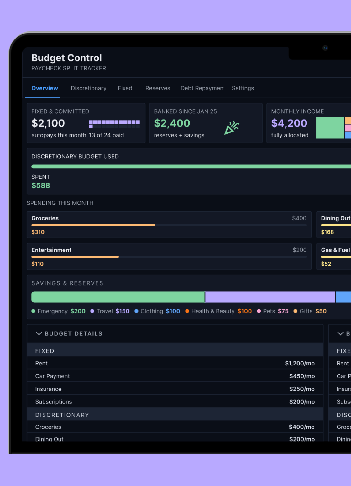
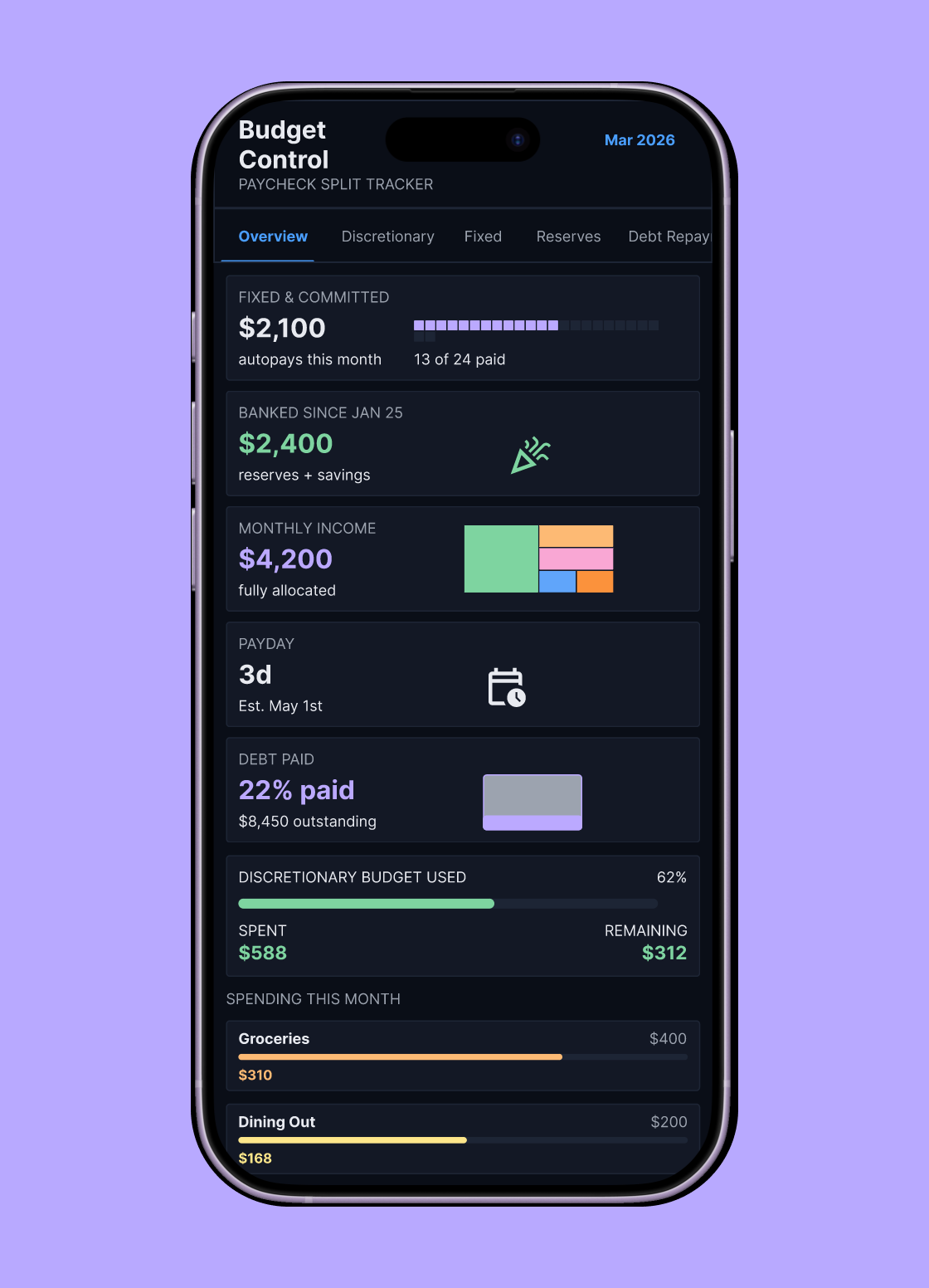
I built this personal finance dashboard in collaboration with Claude AI, without prior React experience. I started with a concept of what I wanted, focused on specific use cases, and added features as I went. Development was fast, which let me stay focused on realistic use cases, testing, and design adjustments rather than getting stuck in setup and syntax.
Connecting Claude with Figma gave me more control over the visual design. I'd iterate on designs in Figma, then Claude would update the tool to match. The loop between design and build was tighter than anything I'd experienced working with a traditional engineering handoff.
The problem
Budgeting apps answer the wrong question: what people abandoned, and why
Before designing anything, I ran discovery interviews with participants across a range of ages and income levels — from a longtime spreadsheet budgeter who built their own system in Excel over a decade ago, to a student who tried Rocket Money and Credit Karma before retreating to a Google Sheet — and combined them with a synthesized set of pain points that matched what I'd seen and experienced myself. The patterns were consistent:
- 01 Apps report the past instead of guiding the present. "Mint tells me what I spent in October. That doesn't help me. I need to know what to do with the check I got Friday." Every mainstream tool is a rearview mirror; the actual need is a windshield.
- 02 The month is the wrong unit of time. "It's not 'am I over budget for the month.' It's 'do I have enough to get to Friday.'" Money is lived paycheck to paycheck and bill to bill — insurance pulls on the 16th, rent on the 1st, and the scary stretch is the middle.
- 03 Irregular expenses break every budget. "Yearly subscriptions are hard — a bunch of stuff hits in December." Christmas comes every year, tires eventually wear out, and a student loan arrives as one lump sum in September that has to last. Monthly-category budgets have no answer for any of it.
- 04 Trust dies the first time the math is wrong. "If the app says I have $84 left, it needs to actually be $84." One participant abandoned their spreadsheet the month the numbers stopped reconciling — not because budgeting failed, but because they could no longer believe the tool.
- 05 Linking a bank account is a dealbreaker, not a feature. "The apps are kinda scammy. I give them access to my accounts but they try to upsell me." Participants kept their financial data local — a hard drive, a private sheet — rather than hand it to an app that monetizes access.
- 06 Every app assumes you already know how to budget. "I don't want to build a system. I want to type in my paycheck and my bills and have it tell me the answer." The tools demand a working budget as the price of entry — which is exactly what the person showing up doesn't have.



Structure
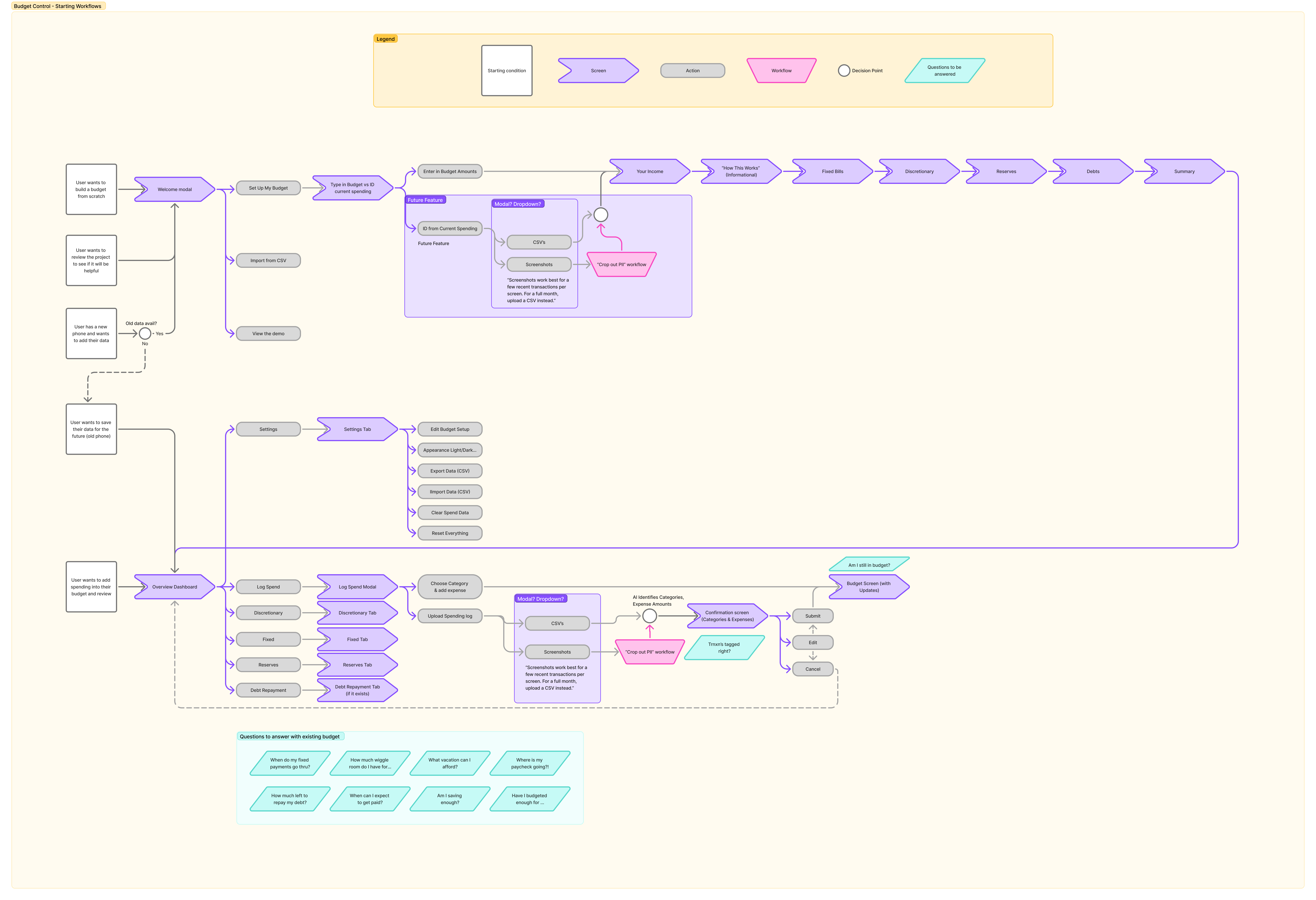
Mapping the flows first: starting conditions, not features
Before any screens, I mapped the tool as a set of workflows that begin with a person's situation rather than a navigation menu: wanting to build a budget from scratch, wanting to poke around and decide whether it's worth the effort, arriving on a new phone with old data to bring along, or just needing to log what was spent today. Each of those entry points had to reach a useful place, which is why the welcome path forks three ways — set up a budget, import a CSV, or open the demo — so evaluating the tool never requires entering your finances first.
The diagram also carries the discovery findings forward as acceptance criteria. Keeping data portable through CSV export and import, rather than a bank connection, answers the participants who wouldn't link accounts. And the parts I wasn't ready to build are marked as future features instead of quietly designed in: identifying spending from screenshots and statements, with a crop-out-PII step before anything is uploaded and a confirmation screen before AI-tagged transactions are ever committed.
The tool
Responsive views
The starting point
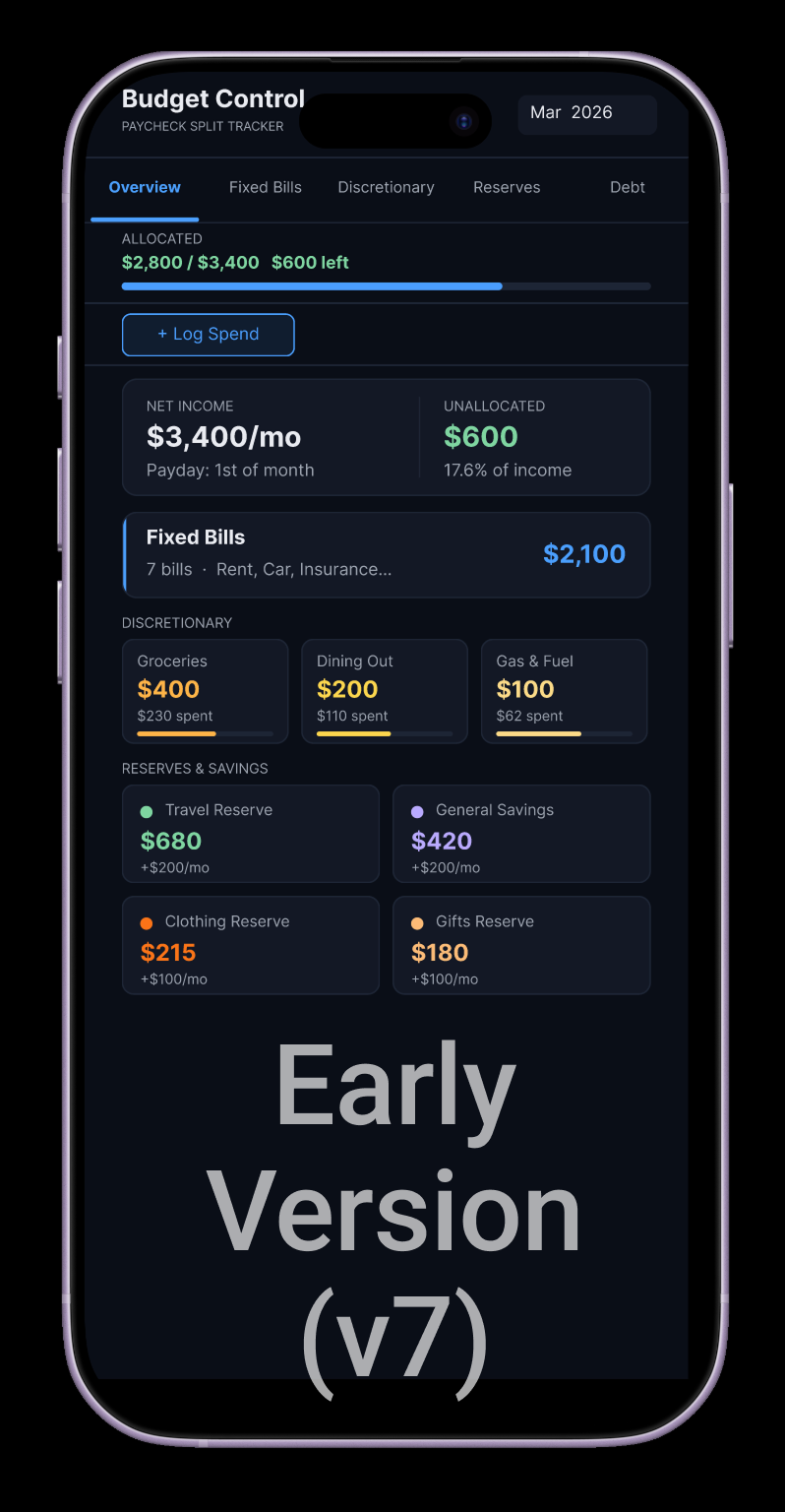
What Claude built first: functional, but not designed
This is version 7, designed by Claude (Sonnet 4.6) inside Figma in early April 2026. As engineering, it was genuinely impressive: working tabs, live math, a plausible dark theme, all produced in minutes. At a glance it looked like a real product. But a glance is exactly where it fell apart, because the design decisions a person would make were missing:
- 01 Small text, everywhere. Nearly everything was set at the same small size, with labels, values, and totals all competing in a whisper.
- 02 Numbers instead of visualizations. Beyond a few thin, unlabeled progress bars, every piece of information was a number to read, not a shape to see.
- 03 No visual priority. Every card carried equal weight, so the one question a budget tool exists to answer — am I okay this month? — was buried. The same $600 even appeared twice under two different names.
- 04 Color as decoration. Six accent colors coded categories arbitrarily, and none of them signaled anything that mattered, like being over or under budget.
- 05 Architecture that mirrored the data, not the user. Tabs for Fixed Bills, Discretionary, Reserves, and Debt organized the spreadsheet rather than the task, and the most frequent action — logging a spend — was a small ghost button floating in empty space.
- 06 Information that trailed off. Content was truncated instead of prioritized: "Rent, Car, Insurance..." hid the actual bills behind an ellipsis.
- 07 No sense of time. The dashboard was a static snapshot. Nothing showed pace through the month, or whether spending was on track to make it to the next payday.
Every version since has been about undoing those defaults: establishing a real type scale, turning numbers into visualizations, giving the page one clear focal point, and restructuring the tool around how I actually budget.
Lessons learned
What working with AI actually taught me
These come from the first stretch of the build, which began in March 2026 with Claude Sonnet 4.6. Models have moved on since, so read them as a snapshot of that moment.
- 01 Save your long prompts elsewhere during busy times. If Claude is slow to respond, your message is likely to disappear. Never to be found again.
- 02 Learn how to scan the code. You don't have to be a proficient coder, but it's worth scanning for things that look strange. You'll catch more than you expect.
- 03 Clear, specific direction produces good results. Vague requests don't. Remind the AI about project goals and use cases as you go. Claude will revert to splashy, useless nonsense if given too much free rein.
- 04 Incremental design changes created regressions. It was helpful to clarify when other tabs would be affected, or to force Claude to plan changes before committing them.
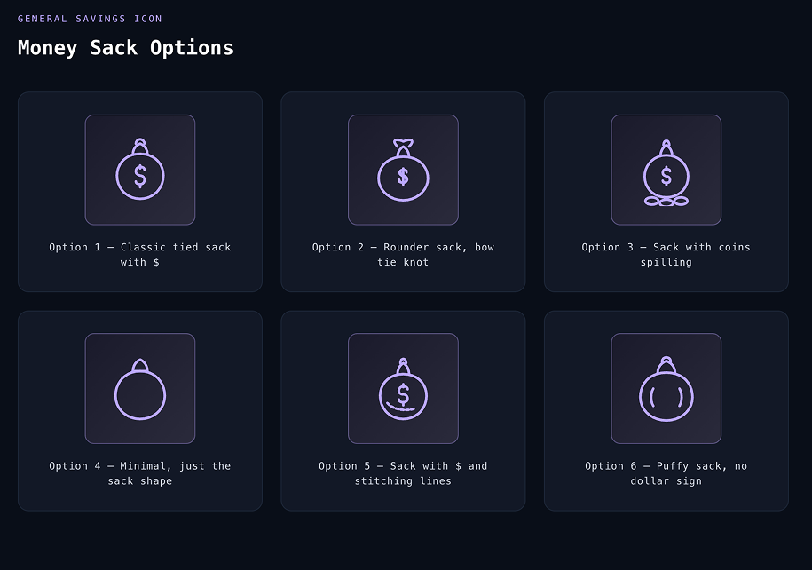
- 05 Claude is not an app designer (yet). Basic design principles were skipped in favor of something that looked like other dashboards on the web. Icons in particular were a rabbit hole. I burned 12 hours of processing time on lousy SVGs with Sonnet 4.6.
I asked Claude what it learned during the session
"The most instructive failure was asking [me] to design custom icons. I iterated through dozens of versions, an airplane, a paw print, a money sack, and the results were consistently poor. AI can generate SVG paths, but it can't see what it's drawing. I eventually maxed out my processing capacity pushing on something that wasn't going to work. The fix was simple: switch to Google's Material Design icon library and reference icons by name."
- Claude Sonnet 4.6, March 2026
Revisited
The same money sack, six months later: the gap is the model, not the months
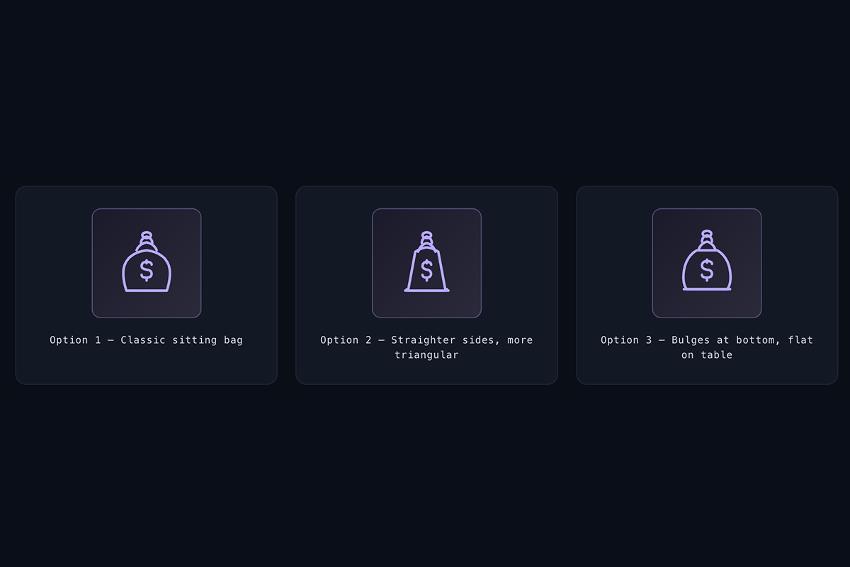
In March, Sonnet 4.6 got worse the more feedback I gave it. The six sacks above were early attempts. The three below came after seven or eight prompts, spread across roughly 12 hours of slow responses and maxed-out usage limits, and they drifted further from a bag with every round.
In September 2026 I reran the test on two current models. Sonnet 5 needed three prompts: the first returned Material Design icons instead of drawing anything, the second returned a single icon, and the third was roughly on par with Sonnet 4.6. Opus 5.5 needed one prompt. The icons created aren't perfect, but the images are recognizable and certainly good enough to use in a non-commercial environment.
So the improvement isn't simply time passing. The larger model can now draw; the faster one still can't, and quietly falls back on an icon library, the same fix I eventually reached by hand in March. Which model you choose is now a design decision.
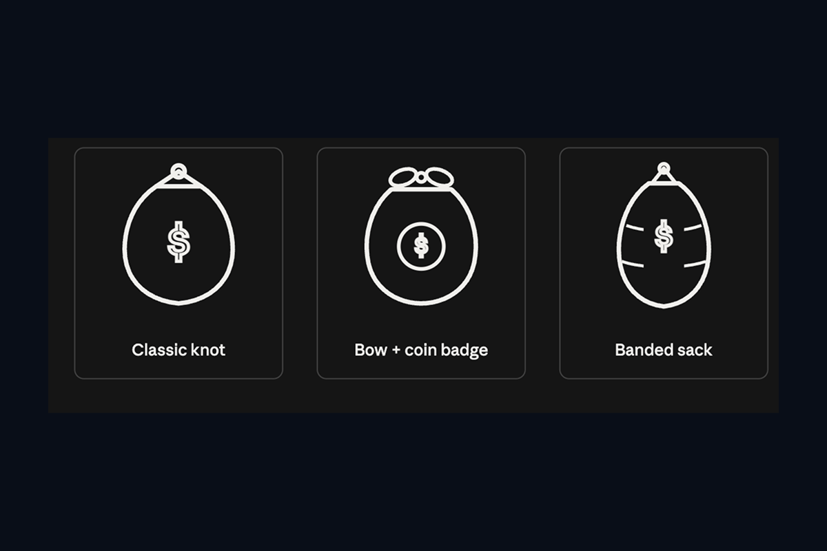

I also asked Opus 5.5 for a broader set. The results were consistent and recognizable, though not flawless: the person icon looks strange, and Claude flagged that itself in its feedback. For the stronger model, icons have moved from "don't bother" to "usable, with a designer's review."

Deployment
Shipping it: from commit to live in seconds
Building the tool was half the work. Getting it reliably onto the web was the other half, and Claude was my debugging partner for that too. I set up a CI/CD pipeline using GitHub Actions that deploys over SFTP on every push to main. Getting it working meant debugging three failures in sequence: a misconfigured deployment secret, an SSH key pair I regenerated after a handling mistake, and a genuine bug in the deployment action's bundled SSH library that only appeared on newer Node versions. Claude verified that last one against the maintainer's issue tracker before recommending the fix, an upgrade to v3 of the action, a complete rewrite that sidesteps the buggy library entirely.
The app itself shipped broken once too: a blank page traced to two stacked causes. The deploy action's hash file had silently skipped an upload, and Vite's default absolute base path broke every asset URL in a subdirectory deploy. The fix was switching the build to a relative base (base: './' in the Vite config).
The pattern that mattered: Claude read my workflow logs, told me which errors were my configuration and which were upstream bugs, and flagged a security mistake I would have missed. The result is commit, push, live in under a minute. This section, like the pipeline itself, was written with Claude Code.
name: Deploy to Skystra
on:
  push:
    branches: [main]
jobs:
  deploy:
    runs-on: ubuntu-latest
    steps:
      - uses: actions/checkout@v4
      - name: SFTP Deploy
        uses: wangyucode/sftp-upload-action@v3
        with:
          host: # redacted
          port: 22
          username: ${{ secrets.SFTP_USERNAME }}
          privateKey: ${{ secrets.SFTP_PRIVATE_KEY }}
          localDir: ./
          remoteDir: # redacted
          exclude: ".git*,.github*,node_modules*,.DS_Store"
Status
Live: and still evolving.
✦
Live tool, refined and improved over time
0→
Built entirely from scratch using AI-assisted design
↑
Learnings accumulating with each iteration
The tool is live and stands on its own — and I keep refining it as it evolves, so new learnings and screens may appear here over time. Try the tool or get in touch to discuss AI-assisted design.